Sports Branding Studio
August 5, 2025
Branding & The PWHL
A deep dive into the PWHL’s team branding strategy, why cohesion came at the cost of culture, and what they can do differently with Seattle and Vancouver.…
branding in women's sports
branding strategy
community-driven branding
creative direction in sports
design by committee
hiring local designers
hockey team names
league branding
Montreal hockey club
New York Sirens logo
PWHL 2025 expansion
PWHL branding
PWHL expansion teams
PWHL team logos
Seattle hockey team brand
sports branding critique
sports culture and design
sports design hot take
Sports Identity Design
sports marketing strategy
team identity development
Toronto hockey branding
Vancouver women's hockey
women's hockey league design
Disclaimer*
It's not my intention to criticize anyone or their work here. Creative is inherently objective, and beauty is eye of the beholder. Sometimes things feel out of alignment, and I think this the PWHL branding is a great example of it. The design work is excellent, yet, something feels off to me, so I'd like to talk about some possible reasons this migh be.The Problem:
Cohesion / CultureThinking Out Loud
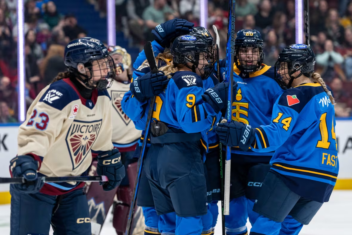
I was surprised to find out that in an unconventional move, the same company was hired to do the identity and branding work for all six teams in the PWHL, at the same time.
I've never seen or heard of anything like this before, but what an exciting project to work on. I imagine the league wanted to have a cohesive look and feel across the board, and I get that. Other leagues strive to do this too, and on the surface it seems like a pretty smart thing to do. The NBA, for example, while not formal or mandatory, has standards for what team logos "are urged to include", like elements of a basketball in some creative way. Once you notice it, you won't be able to unseen it. It's not unheard of, especially when you're building a league brand, not just a collection of teams.
That said, if you look at the NHL’s 32 teams. It’s a mixed bag. You've got flat, simple Original Six logos, then circles, characters, animals, crests... some are prim and proper, some are silly and cartoonish... it’s chaotic. They aren't all perfect by any means either, but they are deeply tied to their cities and fanbases, and the variety sparks endless debate and emotional investment.
With the PWHL, it feels like being in tune with the culture and spirit of their communities got dealt for something more... corporate.

The New York Sirens
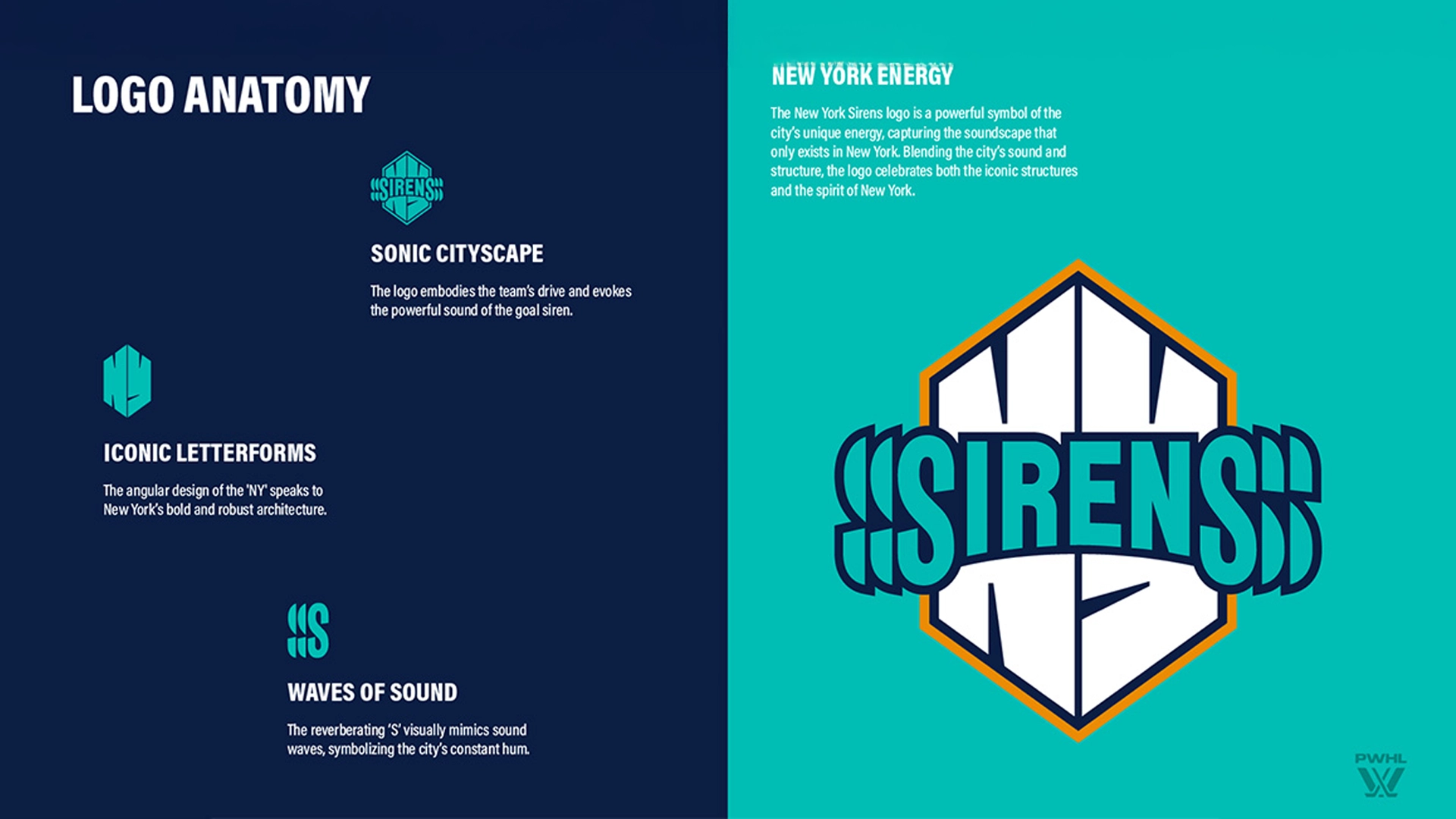
I'm not from New York, but I feel like I get it. This is the home of the Yankees, Mets, Rangers, Islanders, Jets, Giants, Knicks, and Nets. Every one of those brands is iconic, innately New York. New York teams don’t just represent a sport, they represent an attitude. The thing about New York fans? They’re fiercely loyal, but they also own an intense hatred for their rivals with equal passion. That’s part of what makes the sports culture in the city electric. With the Sirens, The name, the colours, the design, none of it really feels "New York". Rather, it feels like they wanted it to be "for everyone" in New York, and that might the least "New York" thing ever.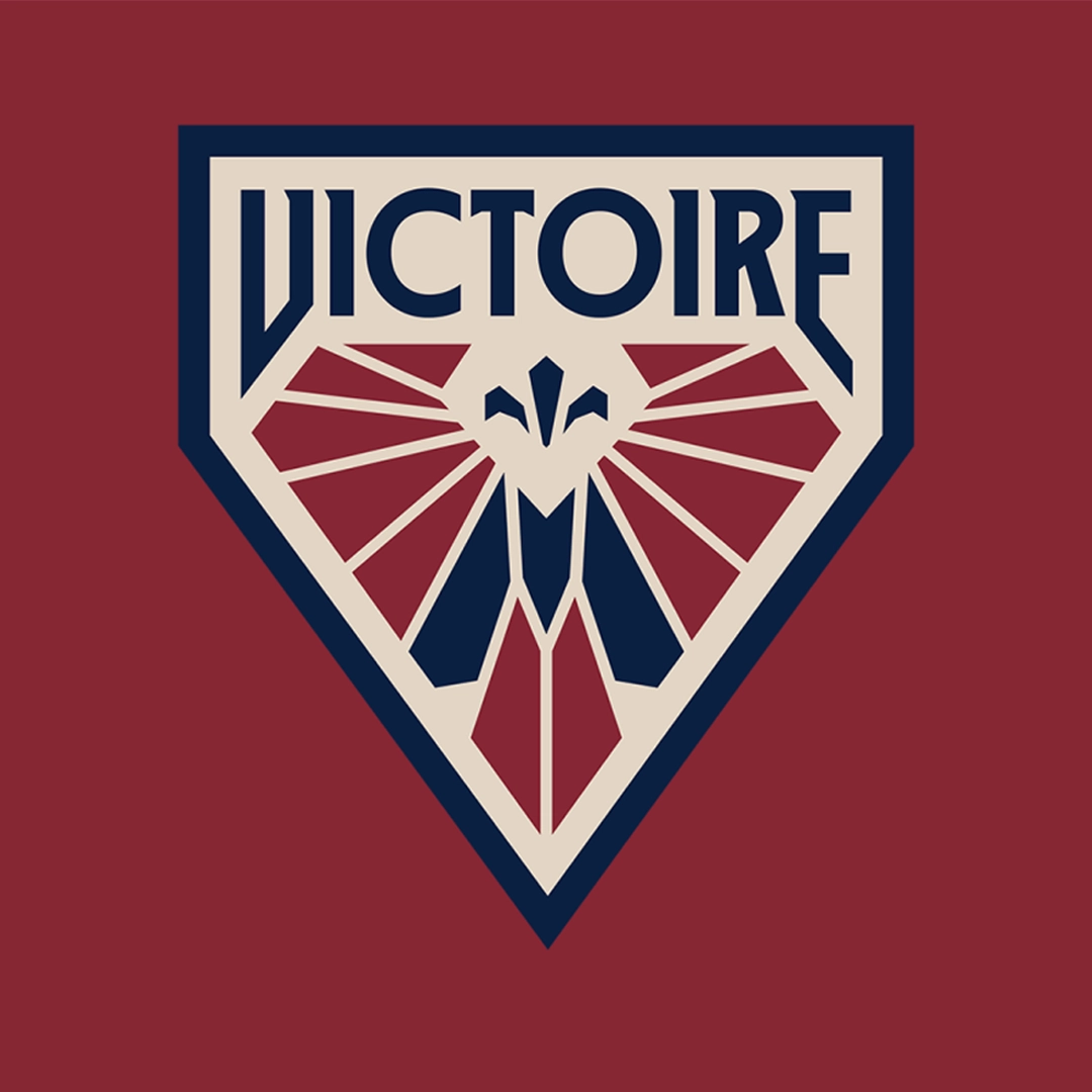
The Montreal Victoire
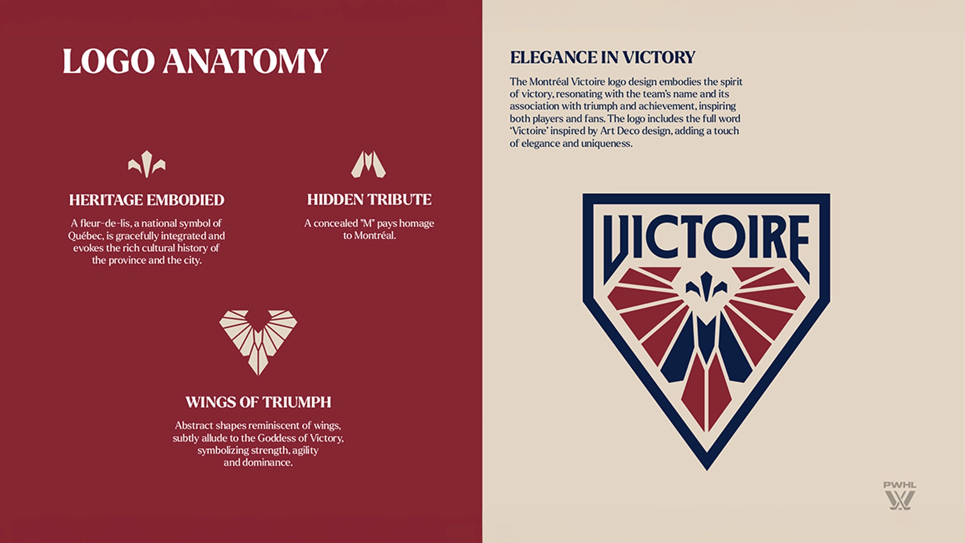
I'm also not from Montreal, so I'm curious about how people from Montreal feel about this one. As an outsider looking in, it just looks and feels right. Maybe it was easier to understand or assess the community and culture because French Canada is very unique in its own right. The vibe matches the tribe, Chef's Kiss.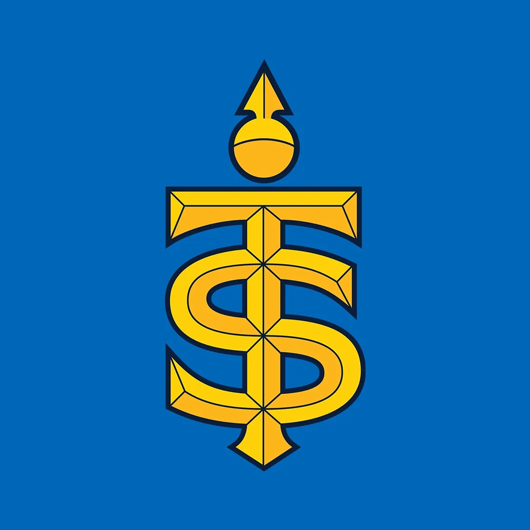
The Toronto Sceptres
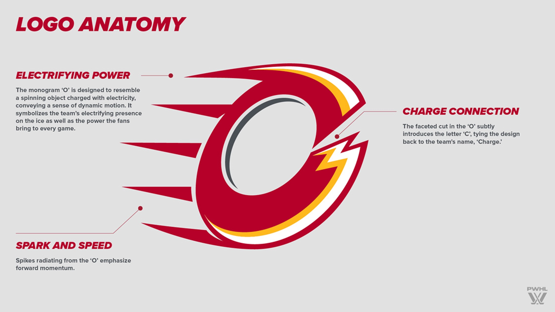
I am actually from this place... and I am actually a fan of this team, and this design. However, something just doesn't feel right. I suppose if I were doing the research for this project, I would need to speak to team leadership, players, fans, employees, and so on. I'd need to learn what women's hockey means to them and their community. I'd need to study the symbolism that's already part of their shared history and culture, and for some reason I don't see strong monarchy vibes being the outcome. Again, I like the way it looks, I just don't feel it. But maybe, in the immortal words of Nike CEO Phil Knight, maybe it'll grow on me.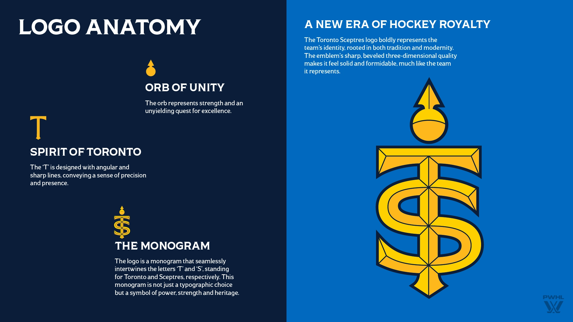
Process Makes Perfect?
Starting the PWHL's inaugural season with clean slates for each team, i.e. “The Toronto Hockey Club” was actually a pretty brilliant idea. Instead of a bunch of suits in an office somewhere holding on to the end of some poor designers pencil, creating something devoid of anything human, you let the team and the community grow into their identity. It creates space for something organic, something real, to take root.
It worked beautifully for the Washington Commanders Football Team, formerly the Redskins, which was changed for obvious reasons. To me it feels right, and they took the time to get in tune with their fans and come up with something that makes sense.
But then it felt like the powers that be, didn't see it through. Maybe.
Maybe the idea of not having everything buttoned up on day one scared the hell out of someone at the top. Maybe they didn’t trust the process. Whatever the reason, it looks like they defaulted to Plan A?: centralized, controlled, and overly polished. I could be completely off here, but as someone who works in this space, from the outside looking in, that’s what it feels like. There was awesome story to write here.
Second Chances
With Seattle and Vancouver coming into the league in 2025, there’s a chance to get this right. This is what I'd love to see.
Step one:
Hire local designers. Ideally, people who are already involved in women’s hockey. They exist. They’re talented. And they understand the community in a way no outsider ever will.
Step two:
Give the team time and space to develop its own identity. Let the culture build. Let the fans and players shape the story. At the very least, give the designers access to that process so they can create something rooted in reality, not just brand decks and corporate moodboards.
Give them the tools. Then get out of the way.
Over time?
I can’t wait to see what this could grow into. If and when they get it right. Watching women’s hockey grow the way it has over the past few years has been incredible.
Over time, I think each team will find its identity. The sooner the league refines its approach and puts the focus back on the community — instead of a few inflated egos — the sooner we’ll start to see some truly amazing work.